Under Review: Top five Astros jerseys of all time

October 28, 2022

Under+Review%3A+Top+five+Astros+jerseys+of+all+time

After 59 years, five pennants, and one world championship, the Houston Astros have created many memories for Houston residents.

Whether it was the Astros’ heartbreaking loss in the 2005 World Series or Jose Altuve’s monumental walk-off in 2019 to send the Astros to the Fall Classic, the men in orange and blue have brought the Houston community together by simply playing baseball.

The Houston community sustains this one-of-a-kind connection by wearing Astros jerseys—both new and old—and collecting memorabilia.

As the Astros reach their fourth World Series in six years, it is important to commemorate the history of the organization by understanding the significance of each jersey. In this article, freshmen Gabriel Pope and Pierce Downey rank the Astros’ jerseys based on their histories as well as their aesthetics.

5. Late-Astrodome Jersey

5. Late-Astrodome Jersey

The ‘90s Astros jersey signaled a decaying Astrodome, an up-and-coming future and the rise of a historical group of players called the ‘Killer B’s.’ The Killer B’s was the nickname for the trio Craig Biggio, Vance Berkman and Jeff Bagwell, who led the team throughout the ’90s.

After missing the playoffs through the late-80s and early-90s, the Astros, with the Killer B’s, made the playoffs for three straight years (‘97-’99). While those playoff runs were mostly forgettable, it marked the first time the Astros made consecutive postseason appearances. The nearly 30-year-old ball club was finally finding success in the big leagues, and they were doing so in a dilapidated Astrodome, wearing simple white, blue and gray jerseys with a star over the ‘O’.

The 1990s jerseys were not placed higher on the list because they lack a ‘wow’ factor. Aside from the star that rests on the breast, they were far too simple. The ‘90s was a time of eccentricity and wackiness—a quality that the jerseys fail to properly represent.

4. Colt .45 Jersey

4. Colt .45 Jersey

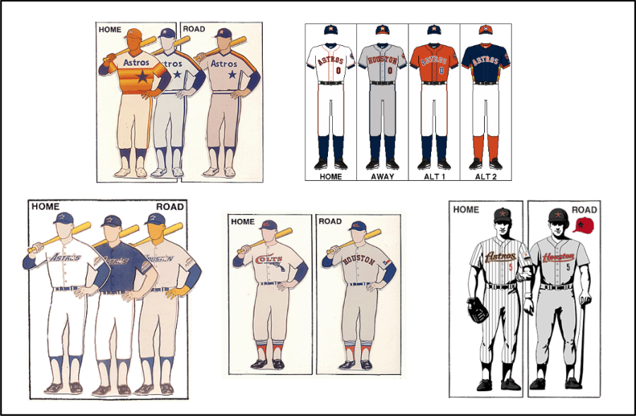
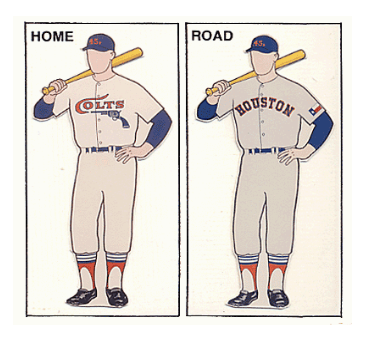
Up until the mid-60s, the Houston Astros were known as the Colt .45’s. Even though the logo rebrand occurred almost 60 years ago, the Houston population still makes significant efforts to stay close to its .45’s roots. Local stores like Academy continue to sell a modern version of the .45 hats, and plenty of spin-off versions can be found on Amazon and other online sites.

The home jersey from this collection features a simple “Colts” lettering and a pistol along the chest. The away jersey is simple and eerily reminiscent of the Astros’ current jerseys. There is nothing entirely spectacular about these jerseys, but they were appropriate for their time.

Although the team would not find immediate success following the debut of the Colt .45 jerseys, these threads are extremely important because they represent an era’s end. The .45’s jerseys were from much simpler, nonchalant days of baseball where fans would pay a buck-thirty for stadium seats and an extra quarter for soda pop.

The Colt .45 jerseys were released at the tail-end of this ‘simple period’ of baseball. As time progressed and baseball became more popular, simple jerseys were suddenly packed with intricate and modern designs, stadiums were experimenting with jumbotrons and game tickets were taking a leap in price. The Colt .45 jerseys are an important artifact in Astros history, to say the least.

3. Enron Gray-and-Black Jerseys

3. Enron Gray-and-Black Jerseys


At the crack of the century, the Astros moved into Enron Park—now known as Minute Maid Park. The new ballpark emphasized Houston’s past as an important railroad center in the middle-to-late 1800s by including the famous railroad tracks that sound whenever a home run is hit. To aptly represent this history, the Astros created a new brick-red and black jersey color scheme. 

These jerseys have a perfect mixture of colors, pinstripes and lettering. The red-underlined ‘Astros’ and ‘Houston’ were a nice touch to a new team that was improving with new players. 

From National League champions to bottom of the division in six years, the Houston Astros went through significant ups and downs while wearing the Enron-inspired uniform. This jersey has a soft spot in Houstonians’ hearts because it paved the way for the current golden age of Astros baseball.  

2. Modern-Day Minute Maid Jersey

2. Modern-Day Minute Maid Jersey

In 2013, the Astros moved from playing in the National League to playing in the American League in order to even out the number of teams in each league. To ease this sudden change, the Astros returned to their traditional colors—navy and orange—and their primary insignia—the H on a star. Similarly designed baseball caps returned, with a few minor color tweaks and a new orange-brimmed, navy-crowned variant.

The jerseys are tidy, timeless and unique thanks to the orange piping. The second alternate jersey combines modernity with a new navy blue color and a hint of throwback with the tequila sunrise pattern on the sides.

The uniforms have been worn for the last nine years, which feature the Astros’ prominent success in seven divisional titles, four championship series victories and one World Series win. This set of jerseys will be one of the Astros’ most iconic of all time.

1. Tequila Sunrise Jersey

In 1975, the Astros debuted their most memorable jersey. The uniform, now a pullover instead of a traditional button-down, featured a solid block of red, orange and yellow stripes from the chest down in a tequila sunrise pattern.

Nolan Ryan is easily the most prolific and iconic Astros player to ever wear this jersey. Ryan is frequently remembered for throwing his jaw-dropping no-hitters sporting the red-and-orange as well as possessing an abundance of swagger. Without Nolan Ryan, this jersey would possess much less meaning and awe.

Even today, the jersey remains important for the Astros fans and organization. It has the most pleasing aesthetics out of any Astros jerseys ever, which is why fans still wear the design today. The colorful tequila sunrise will always be known as one of the most meaningful and attractive features in the organization’s history.

View Comments (4)
About the Contributors
Photo of Gabriel Pope
Gabriel Pope, Staff Writer

Gabriel Pope ('26) joined The Review in 2022 as a freshman. He has participated in an under water basket weaving team for five years. His favorite word...

Photo of Pierce Downey
Pierce Downey, Staff Writer

Pierce Downey ('26) joined The Review in 2022 as a freshman. He is a huge fan of women’s roller derby. He is an avid bird watcher and his favorite bird...

The Review • Copyright 2024 • FLEX WordPress Theme by SNOLog in

Comments (4)

All The Review Picks Reader Picks Sort: Newest

Your email address will not be published. Required fields are marked *

  • R

    Riel PirsunNov 25, 2022 at 11:07 PM

    Valid opinion, but I would’ve put the new space city uniforms on this list. They lack cultural significance but they are also straight fire.

    Reply
  • C

    Cleve HardmanNov 24, 2022 at 8:47 AM

    The current jerseys fail to project anything about the space age. The lettering is too plain and simplistic. I would like to see a modern version of the shooting star jerseys.

    Reply
  • R

    RayNov 10, 2022 at 8:32 PM

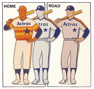
    I also liked the orange shooting star jersey (1971-74). with the orange cap. A precursor of what was to come.

    Reply
  • J

    JHBOct 28, 2022 at 10:15 PM

    Space City! Great article guys!

    Reply
4